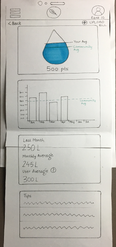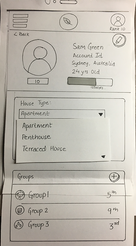
GreenLife is a community-based leader board that tracks and compares your electricity, water, gas, petrol and plastic usage against other environmentally conscious young adults, improving household resource management through feedback, alerts and includes features for the visually impaired.
The project was completed under the supervision of the University of New South Wales for the fulfilment of the course Human-Computer Interaction.
DESIGN BRIEF
"Design a service that promotes sustainable living and focuses on Shelter, Food or Water aspects of sustainability. Considering living practices such as, waste control, water control, food wastage, resource usage and reduction, design a solution that encourages the youth to adopt sustainable practices."
USER INTERVIEWS
Before jumping to any solution, a sample interview of 8 people aged between 18-30 was conducted to explore more about their habits, living conditions, commitment towards sustainable living, pain points and existing opportunities. These interviews were conducted through a written questionnaire where the users were provided full privacy to reduce bias.

User 1
Age: 20-24yrs
Lives with a family of 4
Environmental Consciousness
User 8
Age: 20-24yrs
Lives with a family of 4
Environmental Consciousness
User 7
Age: 20-24yrs
Lives with 6 friends
Environmental Consciousness
User 6
Age: 20-24yrs
Lives with a family of 6
Environmental Consciousness
User 5
Age: 18-20 yrs
Lives with a family of 5
Environmental Consciousness
User 2
Age: 20-24 yrs
Lives with a family of 4
Environmental Consciousness
User 3Age: 25-30 yrs
Lives with 5 friends
Environmental Consciousness
User 4
Age: 25-30 yrs
Lives with their partner
Environmental Consciousness
The top reasons learnt that constrain most youth to practice sustainable living were:
-
Time/Convenience
-
Financial Constraints
-
Lack of knowledge
-
Low Motivation
DESIGN PROPOSITION
A service in form of a mobile application that encourages and motivates the user to adopt sustainable practices without feeling overwhelmed or adding too many steps to their daily schedule.
This was done by introducing gamification into the system. The app allows the users to track their water, fuel, electricity and gas consumption just by uploading a picture of the bill every time they make a purchase. The app then compares the user’s consumption amongst their community and assigns a rank accordingly. The user is also suggested easy tips and tricks to improve their ranking on the board that generates a sense of competitiveness.
The app also produces weekly/monthly reports for the user to keep a tab on their consumption and compare it with other users.
HOW IT WORKS
PROTOTYPING AND TESTING
To gather feedback on the concept of GreenLife, 3 participants were asked to test a paper prototype. The sample comprised of individuals who frequently use apps and have been environmentally conscious.
Before the user testing sessions began, a brief explanation of the concept behind the application was given. During the user testing sessions, each participant was asked a series of questions regarding:
-
Understanding and purpose of the concept
-
The user flow of the app
-
The functionality
USER TESTING FEEDBACK
Usability Testing was split into two tasks
-
Uploading a bill to the application in order to record data. This feature would be one of the most used features in the application, making it important to test.
-
Changing a user’s address. This would simulate a process that all account users would have to do at least once. This task would also be an indicator that the profile section is accessible.
After completing each user testing session, I asked the participants to give feedback on the interface of GreenLife along with its functionality.
While the users completed tasks, it was observed that:
-
The plastics option was considered confusing as it seemed visually different from all the other options and also led to a different result.
-
The term ‘reports’ seemed too vague and confused users as to what the option led to.
-
The Upload button were not chosen first despite usability test task to upload bills. The upload buttons are not obvious enough.
-
The application spacing is intuitive and users did not feel overwhelmed by choices.


