The Client: SkyCiv is a growing start-up established in 2013 that provides structural engineers with a platform to build and design structures on the cloud. The platform is now globally renowned with users in more than 160 countries.
My Role: UX/UI Intern, front-end developer with limited HTML/CSS skillset and the only designer amongst a team full of engineers (fun!).
Work:
WEB REDESIGN
Challenges faced by the company:
1. Users do not trust the software being a startup
2. More than 50% of the visitors to the website do not scroll below the top 30% of the website's homepage content.
3. The users are confused about the features offered by the software. And how to find the available programs.
4. Stagnant user SignUp rate.
A data of 2000 users was analysed by generating heatmaps on Hotjar, to understand the user behaviour at SkyCiv and identify the problem areas to improve the website's interface and make it more intuitive and friendly.
Design flaws identified-
1. Excessive written content on the homepage resulting in high-polyhierarchy.
2. Inconsistency and discoverability of features across the website.
3. Repeatable information and multiple redirections.
Landing Page
Old Design
Proposed Design
More than 50% of the visitors only check the top half. It was needed to convince users to try the software by just looking at the top half.
-
Display the selling points
-
Include a downward facing arrow to encourage users to scroll down
Visually communicate about the product
Small write up about the amazing features of the product without burdening the users with endless amount of text and yet convincing them .
Now that we have convinced them why we are unique.
Tell them what to do next!
By inducing behaviour and telling them how easy it .is to use the software.
Generate Trust by showing numbers and
reviews.
One last Summary along with Call to Action.
The design was approved and can be viewed by visiting the SkyCiv website.
Sign Up Page
Added the value proposition to remind users how SkyCiv is a better platform than others.
The design is currently live on the website and can be seen along with other redesigned pages by clicking on the links belows:
MICRO INTERACTIONS
While developing the pages on WordPress, I took the liberty to introduce micro-interactions on a few pages to make the website more modern and interesting.

The interactions were developed using basic HTML/CSS knowledge and would activate once the user hovers over the icons.
They were loved by the SkyCiv team.
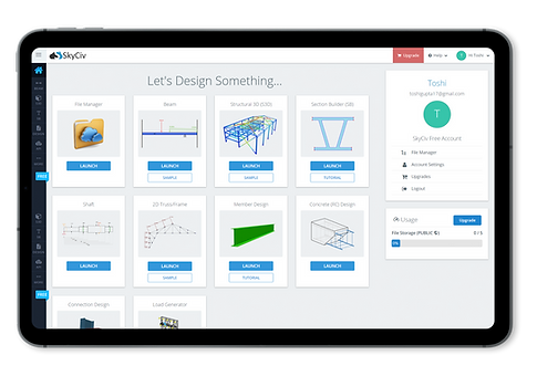
DASHBOARD
Skyciv was well aware of the challenges that users faced while navigating through the software:
-
Finding the right program
-
Seeking to install the software when it's cloud based
-
How to access files
-
Finding support
-
How to upgrade/pricing
Old Design
Design Flaws Identified:
-
Extremely occupied dashboard that often confused the user
-
Redundant launch button
-
Same information presented multiple times
New Design


Reduced redundancy with clean modern design
Minimal and categorised dashboard with an easier user flow.
The design was approved by the team and is currently under construction process.